How MasonryGrid works
This page explains, in plain terms, how MasonryGrid decides where each item in your grid goes. It’s not an API reference. For complete details about the available components, props, and configuration options, refer to the documentation for your framework package: @masonrygrid/react, @masonrygrid/vue, or @masonrygrid/angular. Instead, it’s a guide to understanding the layout’s behavior: why it looks the way it does.
The core idea
A masonry layout packs items of different heights without leaving vertical gaps between them, like stacked bricks. The most common way to do this is to decide, for each new item, which column to drop it into (usually the shortest one at that moment).
MasonryGrid takes a different approach. Instead of inventing its own columns, it lets the browser lay out the items with a normal flexible grid, side by side, wrapping to a new line when they no longer fit. Then it pulls each item up just enough to rest it against the one above, closing the vertical space left over.
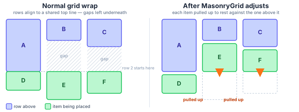
That difference is what lets it mix widths freely, a large item next to two smaller ones, for example, without losing the masonry-style packing. A fixed-column system can’t do that as naturally.
How it decides where each item goes
Whenever an item is positioned, the layout looks at the row above it and checks which of those items it shares horizontal space with. Among the ones it shares space with, it picks whichever one reaches furthest down, not necessarily the tallest, but the one that, given its position and size, ends up deepest on the page. It then rests right below that one, respecting the configured spacing.
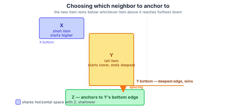
If no item in the row above shares space with it (uncommon in practice, since rows tend to fill the whole available width), it rests against the nearest one instead.
This is what keeps two items from overlapping when their widths don’t line up from one row to the next.
What happens when content changes
The layout isn’t computed once. It recalculates automatically whenever the container changes width (resizing the window, for example) or whenever any item changes height (an image finishing loading, for example). You don’t need to trigger anything manually.
The calculation and the visual update happen together, in the same instant. This avoids the flicker or visual jump that would otherwise show up if the browser painted a half-updated frame.
What makes it different
-
Real width mixing. You can combine items of different sizes in the same grid without manually curating their position.
-
Preserves content order. Unlike column-based systems, the visual order matches the order items appear in your code. That matters for keyboard navigation and screen readers.
-
Plugs into a Bootstrap-like column system. You can tell an item to span a fixed fraction of the width (a third, say) while letting others size themselves to their content.
Disclaimer
No layout algorithm is perfect for every case. These are the situations where MasonryGrid might not behave the way you expect.
The “only looks one row up” case
The layout decides an item’s position by looking only at the row directly above it, not every row above. In the vast majority of cases that’s enough, because a row normally inherits the depth information from the row before it.
But there’s a specific scenario where this can fail: if a row leaves an empty gap at its edge (because no item fit there), and at the same time a fairly tall item from a row further up still occupies that same horizontal span, the layout can miss it.
The result, in that specific case, is an item ending up slightly overlapping with another one two or more rows above it. It’s an uncommon case in practice, since it needs a particular combination of widths to show up, and it’s more likely with free-form widths (in pixels) than with the column system, where row edges tend to line up.
Horizontal spacing with free-form widths
When every item uses the column system, the horizontal spacing between them is always exact, because their edges line up from one row to the next. When free-form widths are used instead (not based on columns), two items from different rows can end up separated by a horizontal distance that doesn’t exactly match the configured spacing, simply because their edges don’t land in the same place.
If exact horizontal spacing matters to you, the column system is the more predictable option.
First load with unknown content height
The layout is computed in the browser, after the items are already on the page. If an item’s height depends on something that takes time to arrive (an image with no declared dimensions, for example), you’ll see a small reflow once that content finishes loading. This is inherent to any masonry layout that doesn’t know the final content size ahead of time. It’s not specific to this one.
Container requirements
The layout assumes standard behavior: items wrapping left to right, aligned to the top, with no extra space redistributed between rows. If the container has an unconventional setup for this kind of layout, the result might not be what you expect.
Where to go next
For the full list of props, their types, and their defaults in your framework, check the README of the matching package (@masonrygrid/react, @masonrygrid/vue, or @masonrygrid/angular).